Case Study: Building the HDCode Business Card Workflow
What changed, why it changed, and what we learned while choosing a default business card variant.
Summary
- Goal: define one default business card for HDCode while keeping creation and export fully automated
- Constraint: keep one logo geometry and one layout while testing palette and context
- Process: generate and export every business card variant programmatically, without opening Canva or using manual layout tools
- Variants tested: five options (Legacy, Primary, Balanced, Winter, Light)
- Decision: use Primary as the default
- Reason: it balanced clarity, restraint, and reproduction reliability
Context
The project began as a design decision and became an automation decision too.
We wanted business cards that felt stylish and intentional, but we also wanted a pipeline that let us create every version programmatically.
That started with a mathematically precise SVG logo build. Once the geometry was stable, we could iterate colour, theme, and layout with predictable, reusable assets.
We held the logo geometry and layout constant, then generated five variants through the same automated workflow.
Problem
The main issue was not geometry. It was deciding the right colour relationships and tone for a default card.
Some variants had strong contrast but felt too loud. Others felt calm but reduced letter clarity. We needed one version that stayed readable, brand-consistent, and reliable in print.
Constraints
- Keep one logo geometry across all variants
- Keep one front/back layout across all variants
- Make the card work on both dark and light contexts
- Ensure exported print assets remain stable and consistent
Approach
We changed palette and contrast while keeping geometry and layout fixed. That let us compare variants directly — on screen, in print exports, and at smaller sizes.
Options Tested
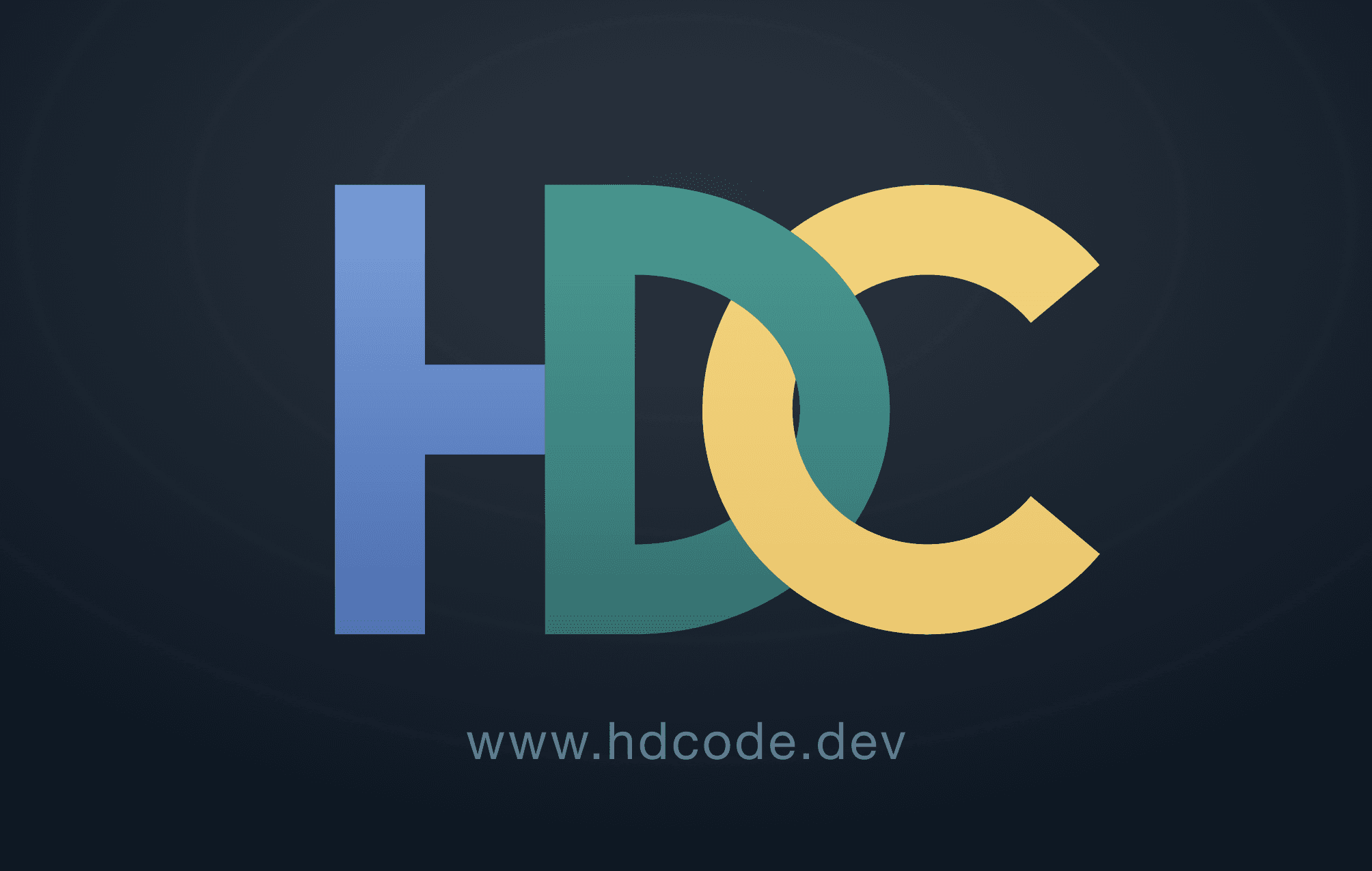
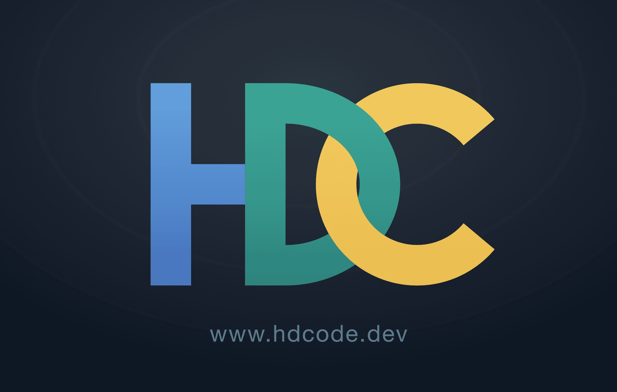
The logo is three letters: H, D, C. Each letter uses one colour from the same triadic family: blue, teal, and gold.
| Option | Logo | What changed | What worked |
|---|---|---|---|
| Original (AI draft) |  | Initial AI-generated profile logo before redesign | Established a fast starting direction |
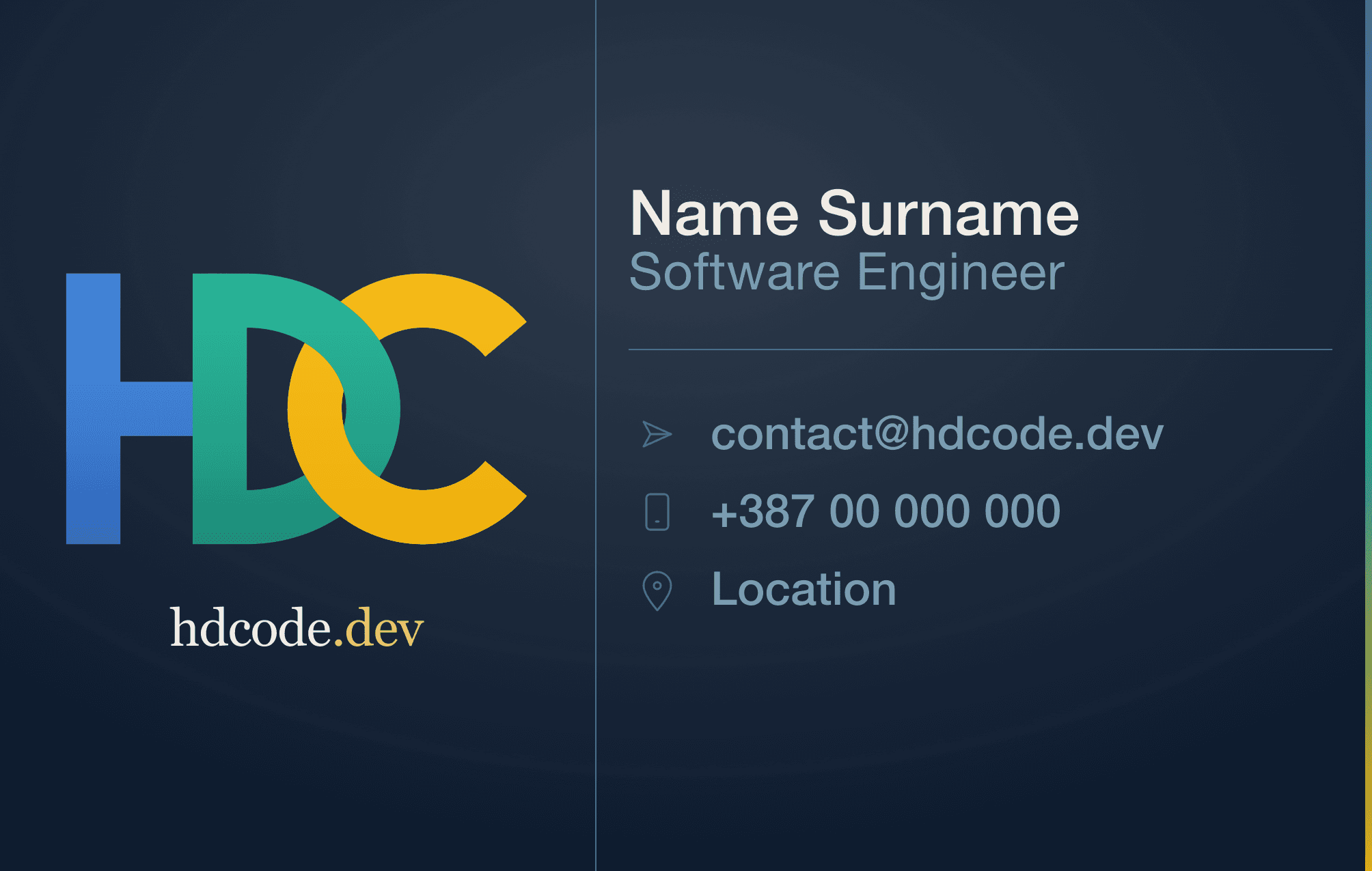
| Legacy |  | Highest saturation and contrast on dark navy background | Strong separation and immediate visibility |
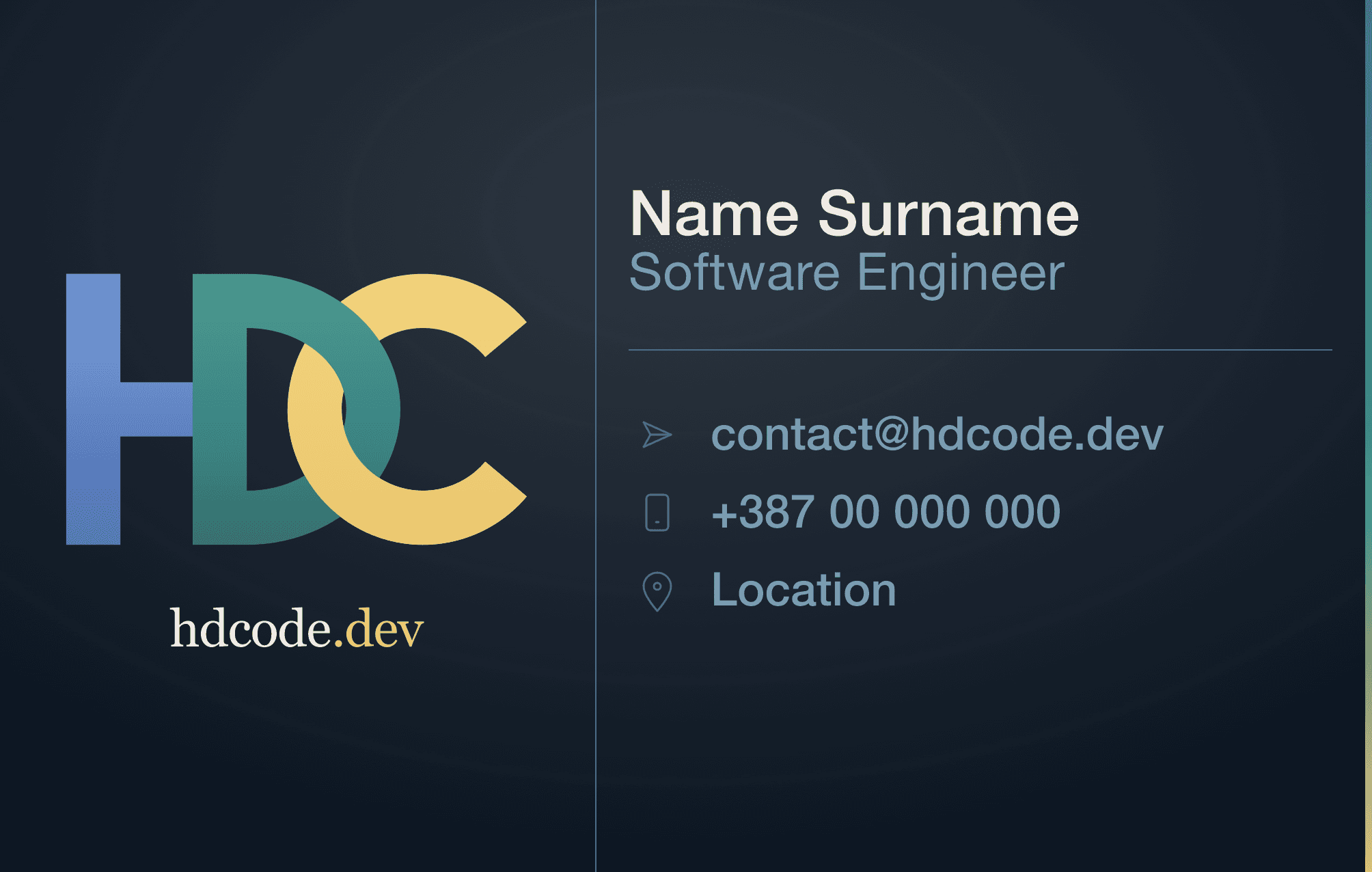
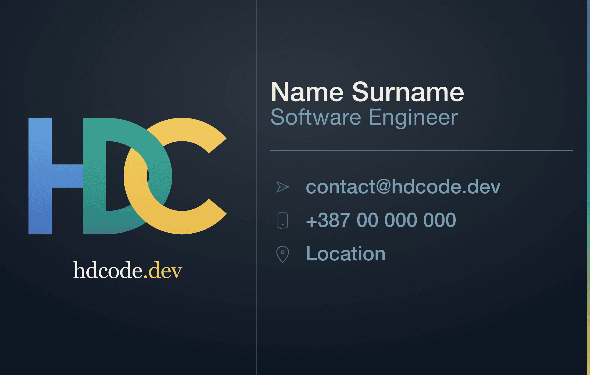
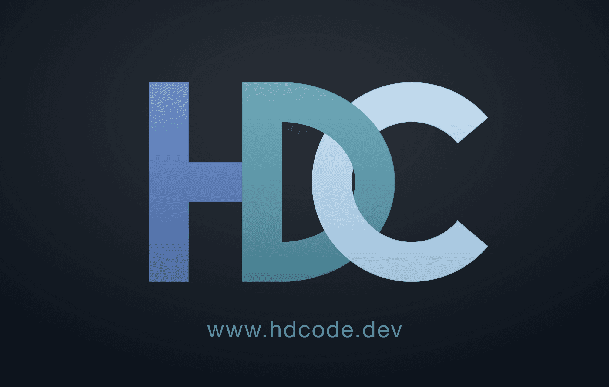
| Primary |  | Balanced triadic palette on dark navy background | Best mix of clarity, restraint, and print consistency |
| Balanced |  | Slightly more energy than Primary | Added energy without breaking structure |
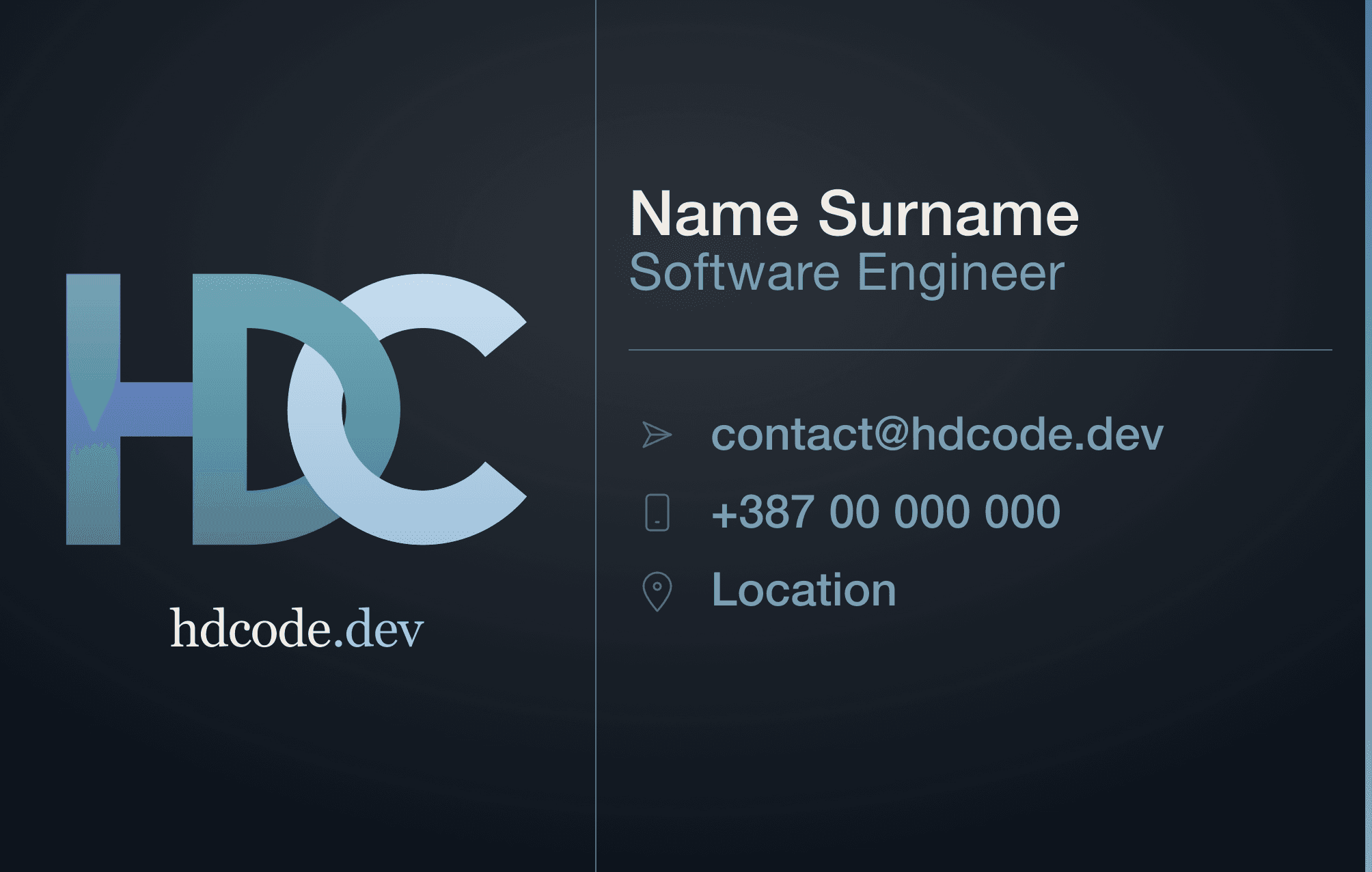
| Winter |  | Cooler, tighter palette with lower contrast separation | More unified and restrained look |
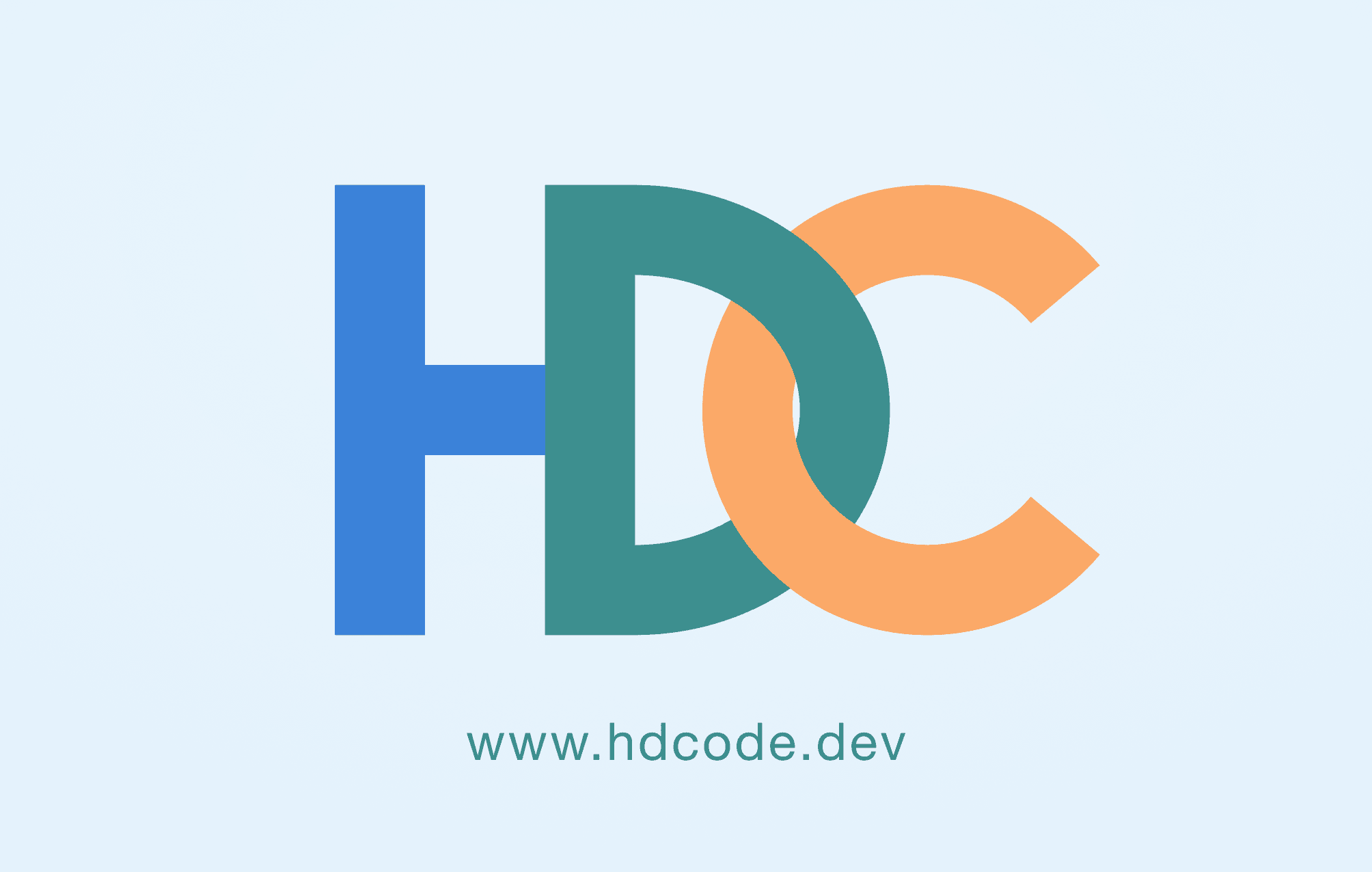
| Light |  | Same workflow adapted to white background | Validated behaviour away from navy |
Decision
Primary was selected as the default.
It was the only variant where letters stayed legible, tone stayed quiet, and exports stayed stable — without needing per-context adjustments. The other variants remain available but are not the default.
Implementation Notes
Key implementation choices:
- C/D interlock: the C is built from two parts - one in front and one behind the D - to create the interlocking effect. Fixed visible seams and overlap artifacts by enforcing strict layer order
- Modular logo build: precise SVG letter parts made the mark easier to recolour, theme, and reuse across cards
- Asset structure: reused one geometry approach and synchronized definitions across variants
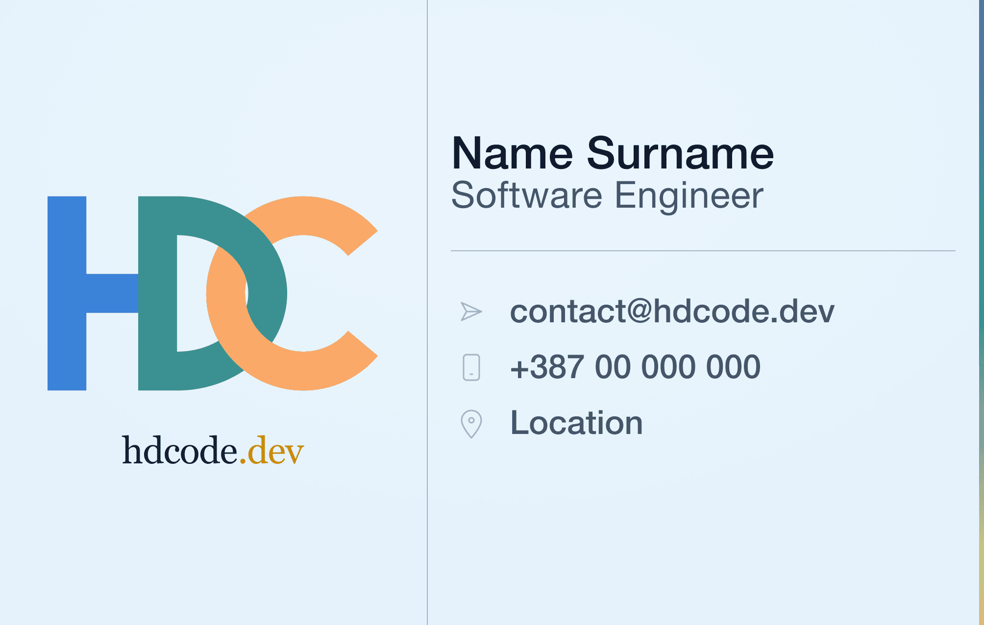
- Front layout (shared across all variants): logo left-aligned and vertically centred, name/title in a right text block, email/phone/location below with icon markers
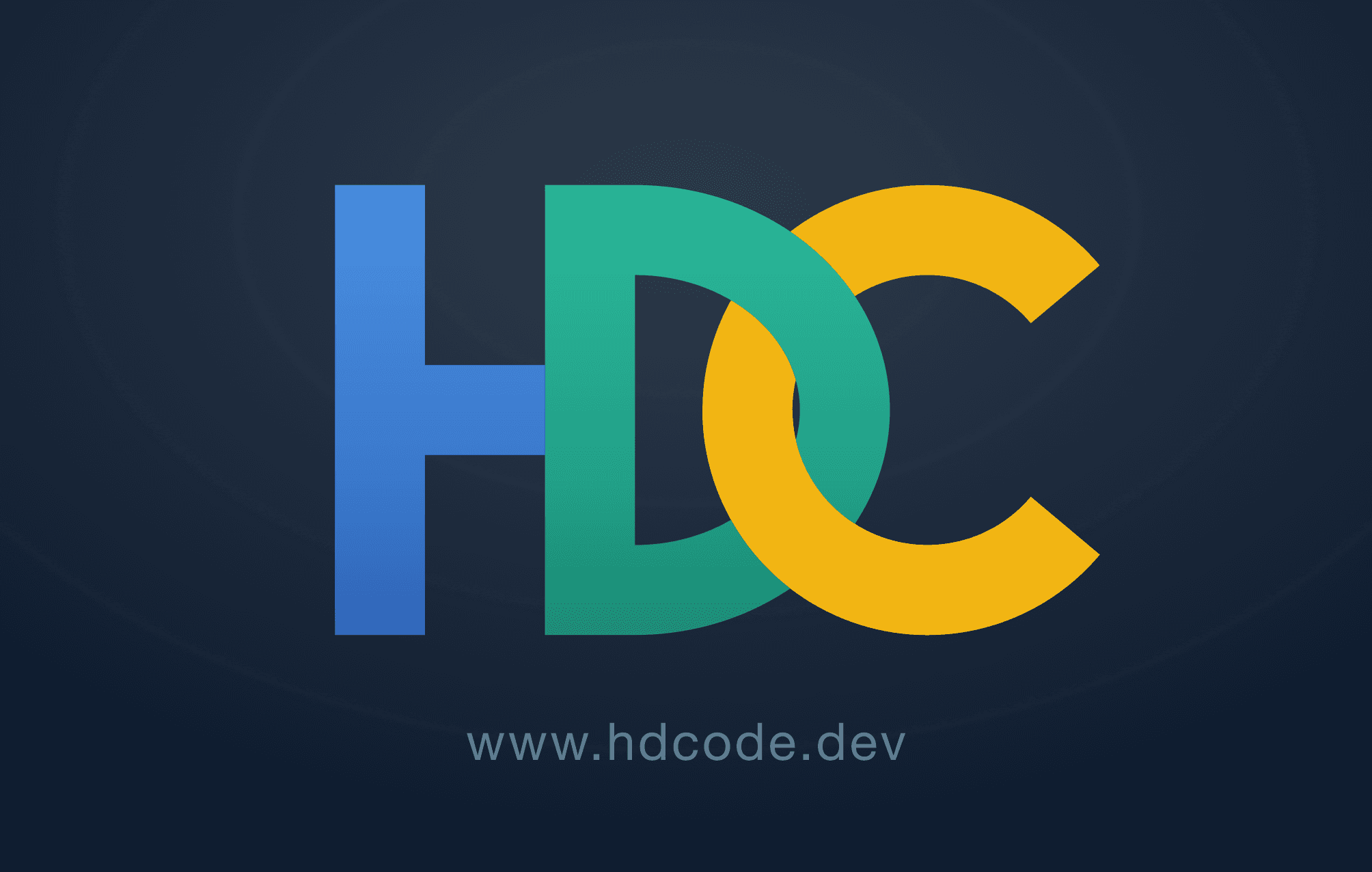
- Back layout (shared across all variants): centred, scaled-up logo only
- Export pipeline: SVG source at 1004×638 px; PNG print exports rendered at 600 DPI
- Quality issue handled: subtle radial vignette introduced export banding and required pipeline-level fixes (see Why Your Exported Gradients Look Like Bullseye Rings)
- Gradient export engineering: aligned color and dither strategy so the same programmatic pipeline could produce stable print-ready variants
Variant references:
Legacy
Primary
Balanced
Winter
Light
Outcome
- One layout approach now supports five tested palette/context variants through the same automated pipeline
- Print export reliability improved through stricter production handling
- Variant selection has a documented decision trail instead of a subjective pick
Tradeoffs
- We gained a reliable default and clearer decision boundaries
- We accepted lower visual intensity in the default compared with Legacy/Balanced
What We Would Do Next
- Test physical print batches on additional paper/finish combinations
- Define explicit usage rules for when non-default variants should be used
Lessons Learned
- Keep geometry fixed when testing palette decisions
- Separate exploration variants from default selection criteria
- Production constraints (like export banding) should be treated as design constraints
This decision reinforces the project goal: one automated workflow that delivers a reliable, print-ready default business card variant, while also making it easy to add more variants, formats, and sizes in a second.